Team Composition
- 1 designer (myself)
- 1 product manager
- 2 additional stakeholders
- 1 front-end engineer
- 1 back-end engineer
A GoProfiles feature for creating company-specific employee achievements
GoProfiles is a people platform within the GoLinks product suite that enables teams to find shared connections, celebrate wins, and boost company culture. It combines the best parts of employee directories and peer recognition to meaningfully improve how employees interact, collaborate, and learn about one another.
At GoLinks, I was the lead designer on the GoProfiles product.
A core tenet of GoProfiles is that employee recognition cultivates gratitude and success within an organization.
As a result, a core feature within the product is "bravos," which are a quick and easy way for employees to recognize the accomplishments of their peers.
To further build on this tenet, we wanted to expand beyond peer-to-peer recognition and also provide a way for the company as an "official entity" to recognize individuals for their achievements.
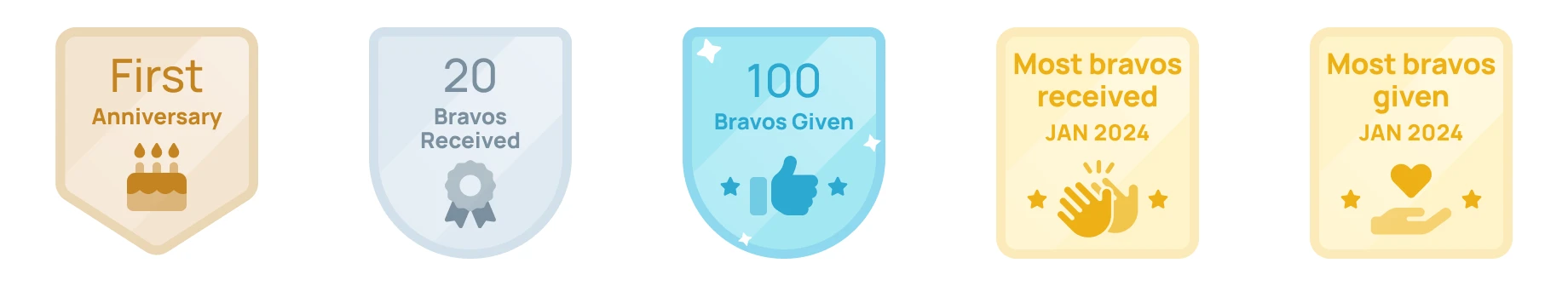
We had already built some default, automated achievements that were awarded based on work anniversary (tenure), number of bravos received, and number of bravos given. But to fully realize the vision for this feature, we needed to enable admins to create their own custom achievements.
Some high-level goals associated with this feature were as follows:
Questions for evaluating design success:
Who do we intend to interact with this feature and in what capacity?
This was also our MVP approach to permissions. Eventually, we saw value in exploring controls within settings to empower individual users (not just workspace admins) to create, manage, and award custom achievements.
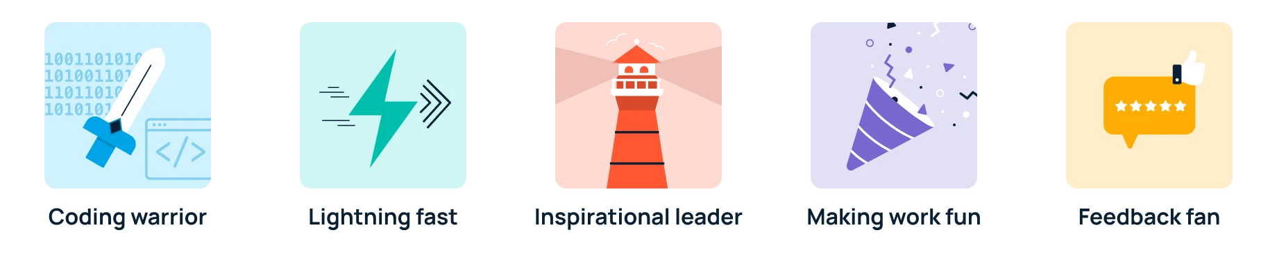
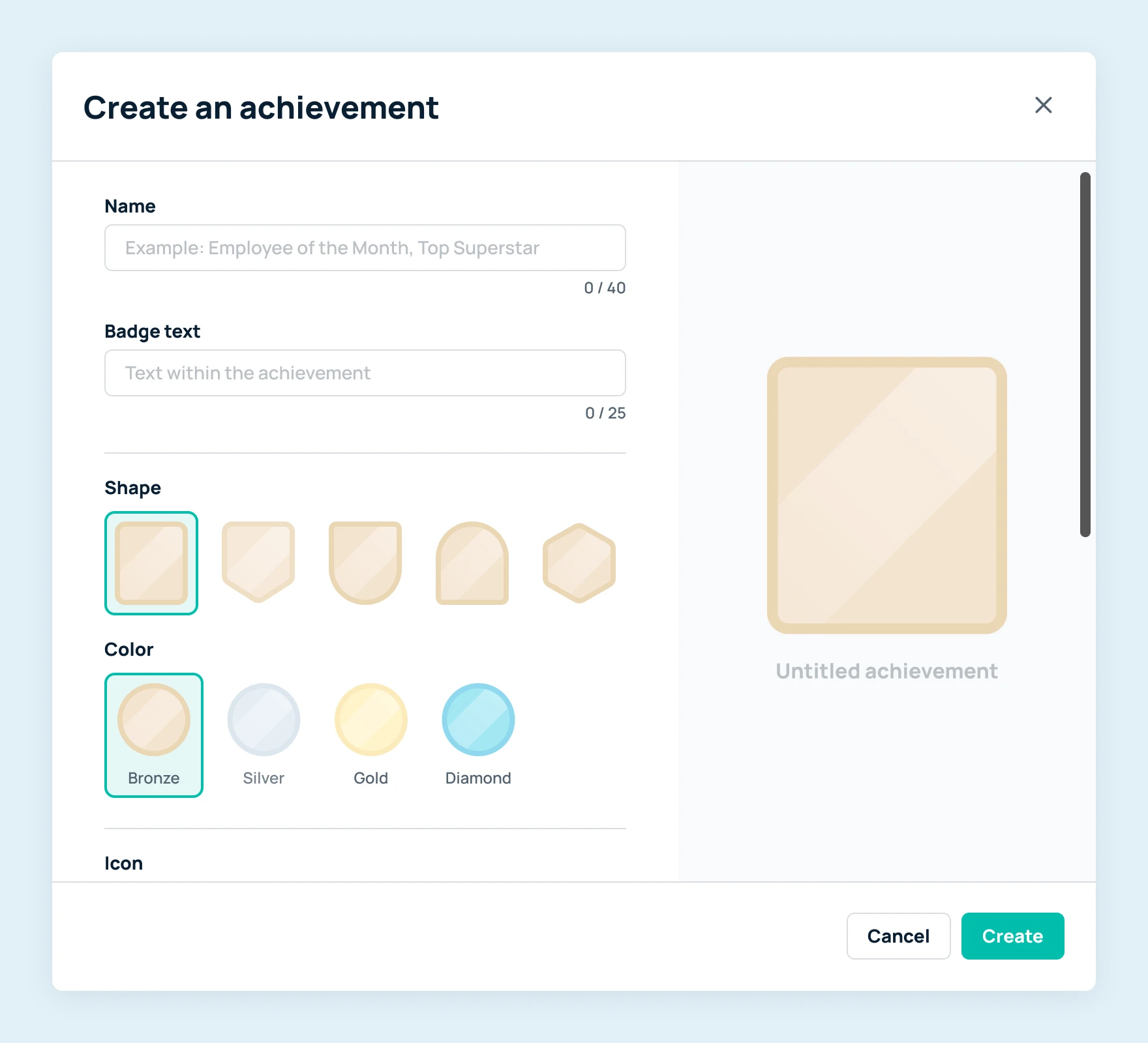
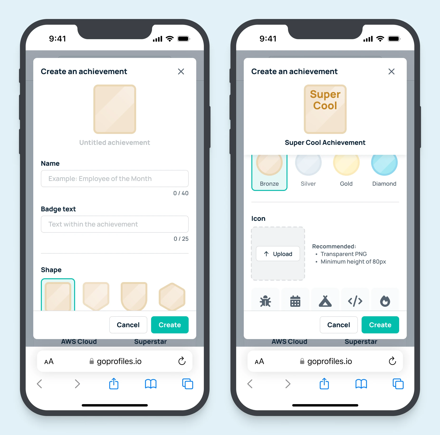
On the design side, we had already established what achievements look like. Because we had previously created the default, automated achievements mentioned above, we had a foundation to build upon. This meant we had an initial set of colors and shapes to choose from.
Additionally, before starting design work, we had a software engineer complete a spike on the feasibility and logistics around generating, storing, and using custom achievements within the codebase. Their findings also detailed how we could programmatically superimpose dynamic content over static images and output a shareable PNG.
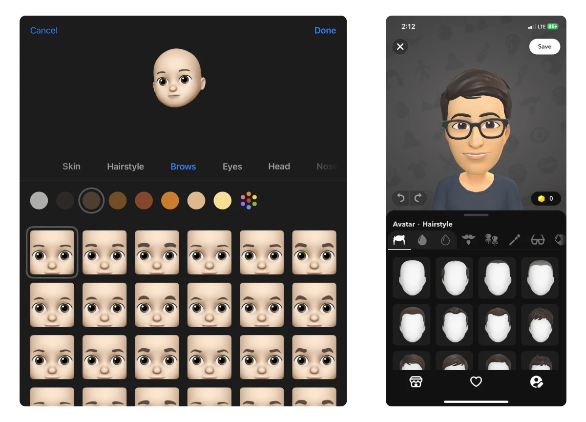
I found some examples of customization flows that were similar in nature. These served as an initial reference for my explorations.
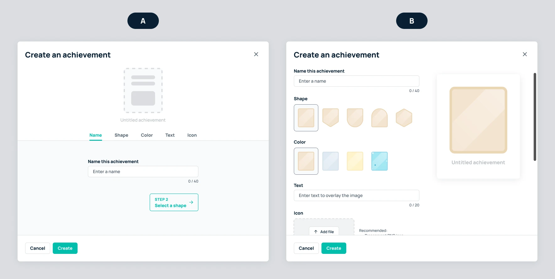
I proposed these two wireframes, along with the references above, to the product manager and design manager (stakeholder) to get some initial thoughts on approach and direction.
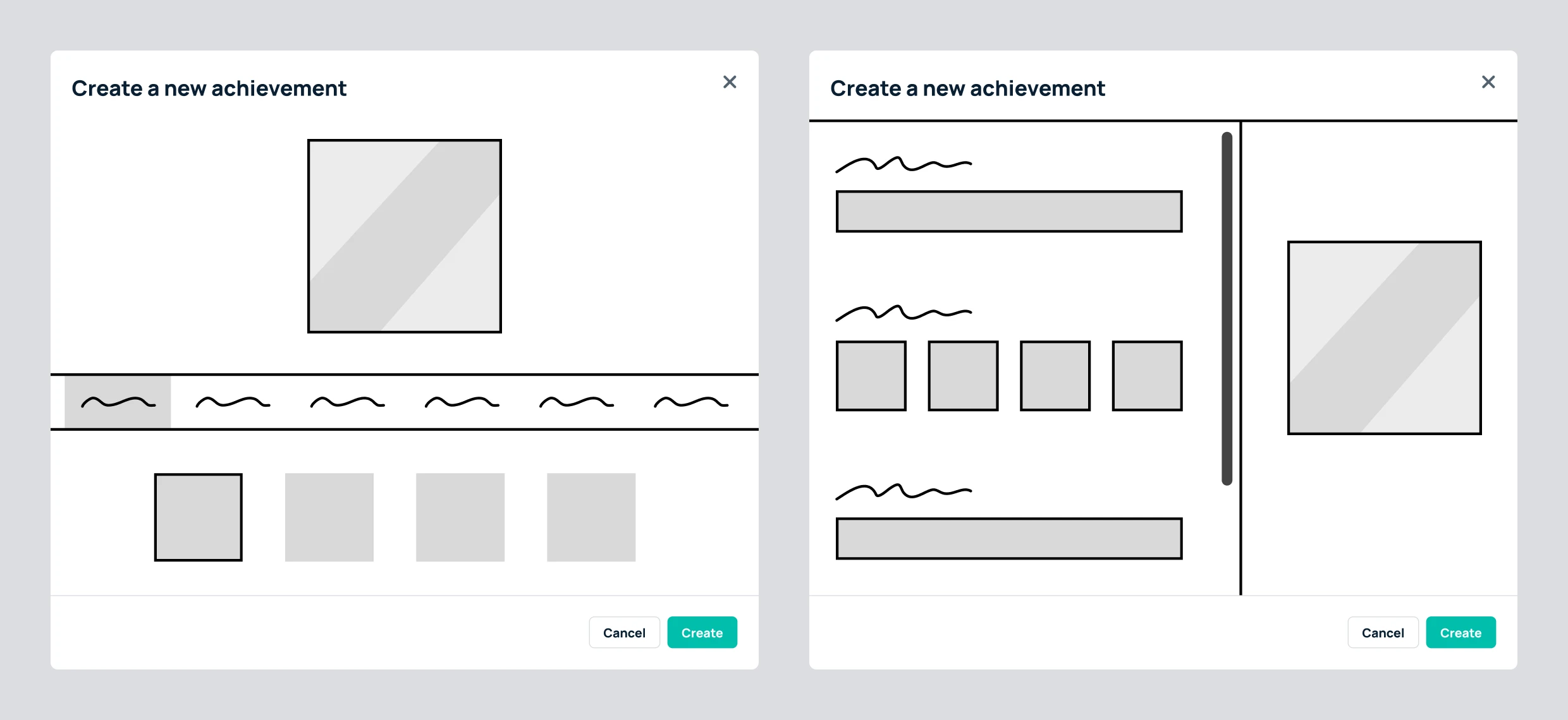
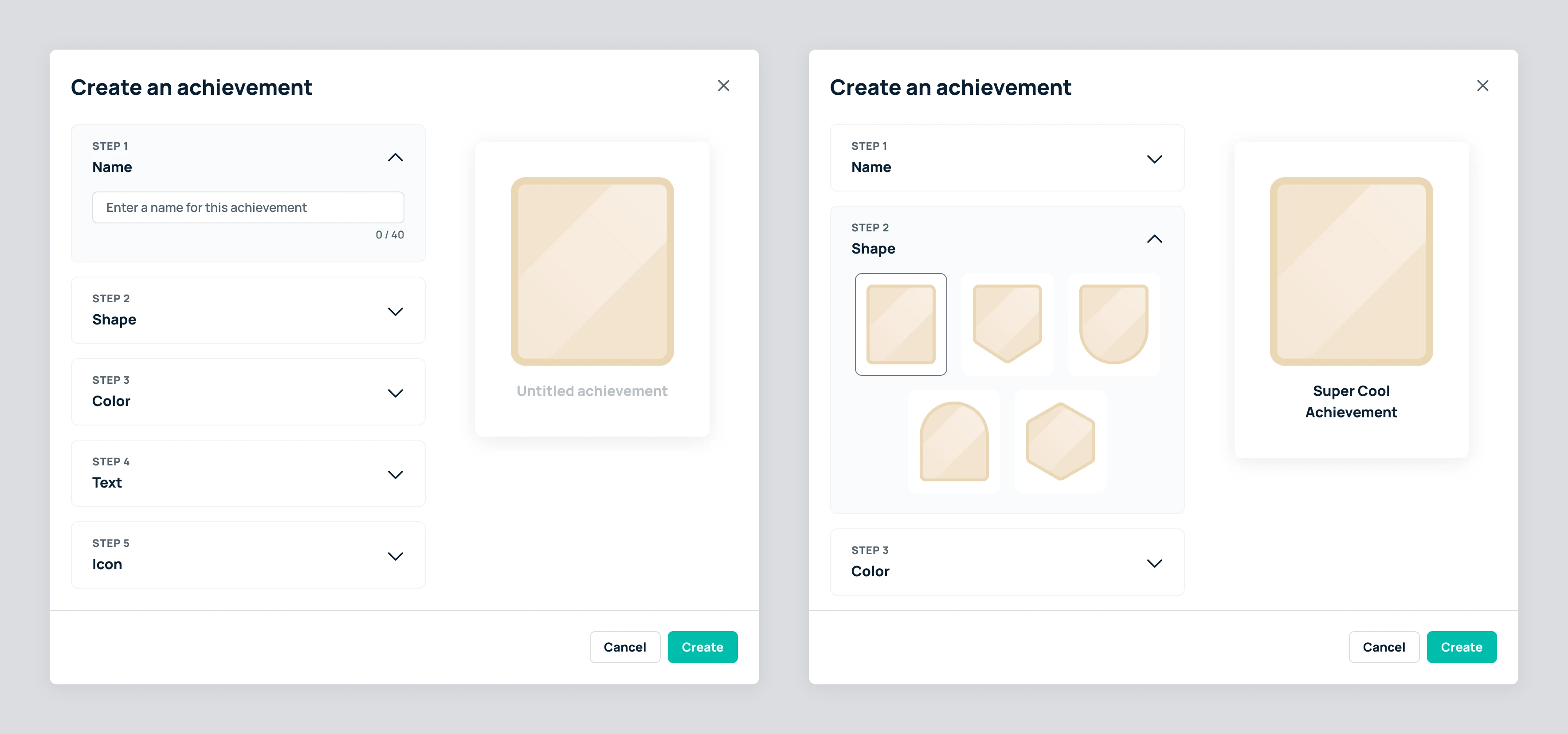
With approval to move forward, I put together some options, got feedback during critique, and iterated. These are the 4 designs we discussed:
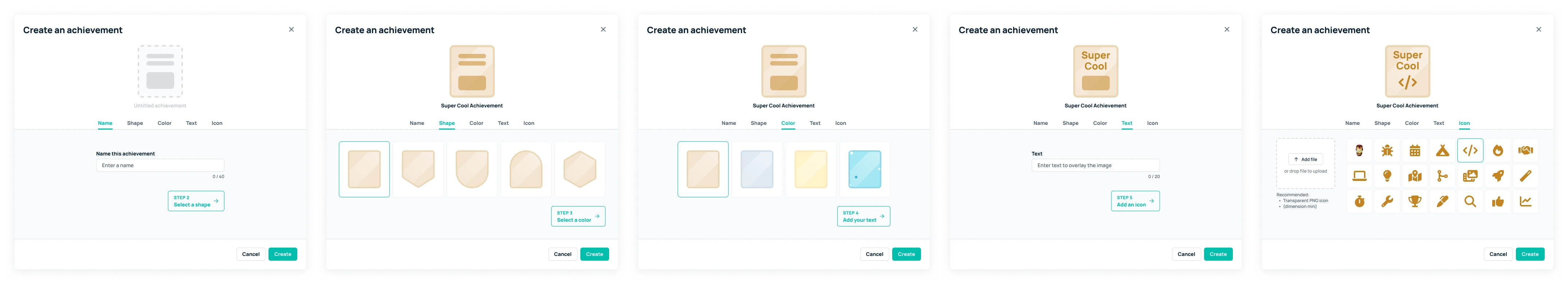
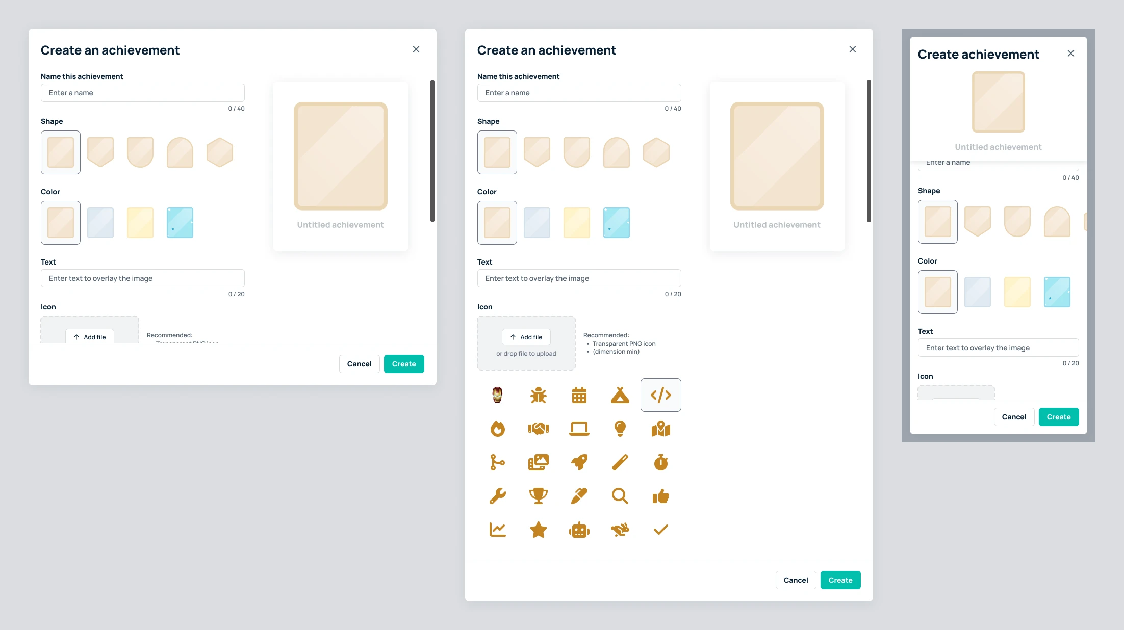
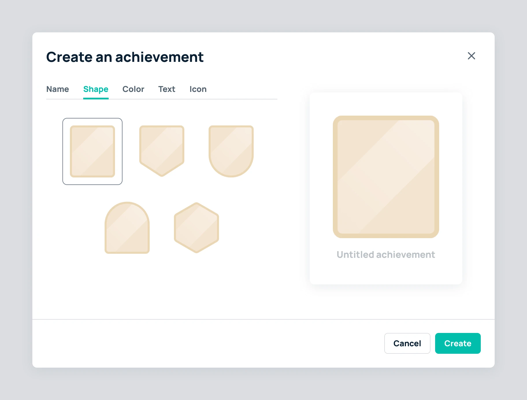
To create an achievement, an admin would need to decide on a few details:
These specifications were based on the default achievements the design team had already created a while back.
To simplify implementation (and to keep achievements consistent for now), we decided to make each field required. So in order to successfully create an achievement, the admin would need to see and complete each step of the process.
We were planning to use inline error messages to help facilitate this experience, but of course, we still wanted the flow to feel as intuitive as possible in hopes of avoiding any error messages in the first place.
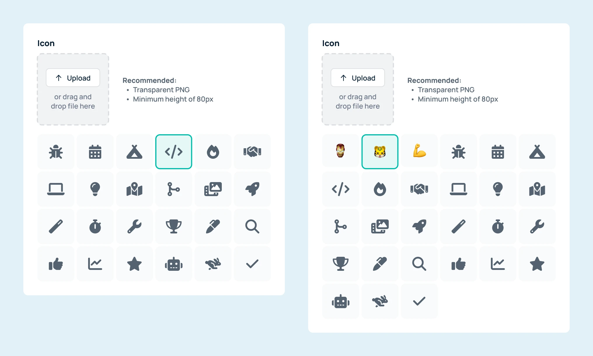
We needed a simple way for admins to add icons to their achievement badges. We wanted to include an image upload field for maximum flexibility. We also wanted to provide a default set of icons to make it easy for admins to create their first few achievements – or to at least serve as inspiration.
Of course, when letting users upload their own images, there is little we can do to ensure "quality." I included some general guidance for image format and dimensions, but ultimately, even a high-resolution, transparent PNG can look out of place if the uploaded image style and/or colors do not complement the badge style and color.
For the default icon set, we quickly ruled out using emojis because the style and color of emojis would not look good against our base badge designs. We wanted to use simpler icons whose color we could adjust to match the user's badge color selection. The obvious solution was to use Font Awesome, our existing icon library.
Ideally, we would have liked to let users browse, search, and filter the full Font Awesome icon library. But in the interest of time, we decided to start with a simpler approach that would not introduce too much added complexity to the UI. So instead, I selected a handful of potentially versatile and relevant icons from which the user would be able to choose.
At this point in the process, I felt pretty good about my design options, but I wanted to narrow in on a specific layout/flow configuration by talking to some users.
Based on the feedback I received during critique, I created Figma prototypes for options A and B. I then conducted an informal, moderated usability assessment. I asked four internal colleagues who were unfamiliar with this feature to complete a task (i.e., create an achievement) using both prototypes. To mitigate some bias based on order, users 1 and 2 saw option A first, then option B; and users 3 and 4 saw option B first, then option A.
User 1
A, B
User 2
A, B
User 3
B, A
User 4
B, A
Overall, both designs were well received and users were able to accomplish the task successfully with little confusion or error. However, it became clear that option A had an unnecessarily high interaction cost associated with tabbing between sections. If a user progressed through the sections and wanted to go back to change something, tabbing back and forth was a little annoying.
I do believe that progressive disclosure can be an effective way to help users complete a task, especially if each step is independent and/or complex. In the case of these designs, however, neither of these factors seemed to be relevant.
Option B allowed users to complete the task a little quicker. One user also reported that it was nice to see all the fields and selections together in one view because it made it easier to see exactly what was involved in the creation process at a glance.
We decided to move forward with option B.
With an approved design direction, I began to refine and finalize the design. One remaining gap that needed to be addressed was error handling.
As mentioned earlier, for the initial release of this feature, we decided to make every field required in order to create a custom achievement. I also decided to keep the "Create" button enabled by default. This meant that most fields would need to support an error message in case the user attempted to prematurely create the achievement. Shape and color fields would not need an error message, however, because an option would be selected by default without the ability to deselect.
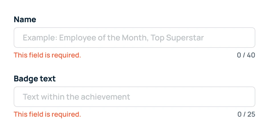
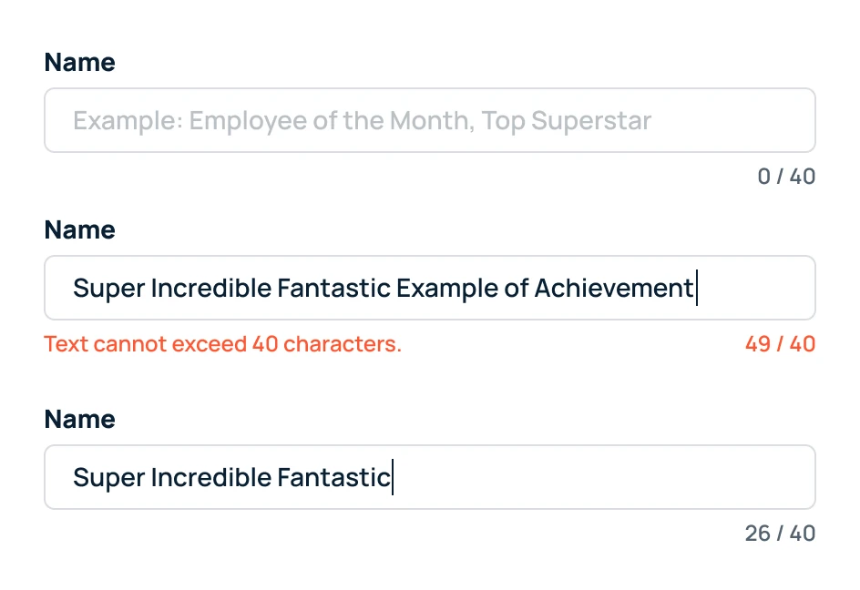
For text input fields, we also had a standard way of providing some leeway to users when typing against the character limit. If the user hit the character limit, we did not prevent further input. Instead, we allowed them to exceed the limit and we displayed an error reinforcing that they need to adjust their input.

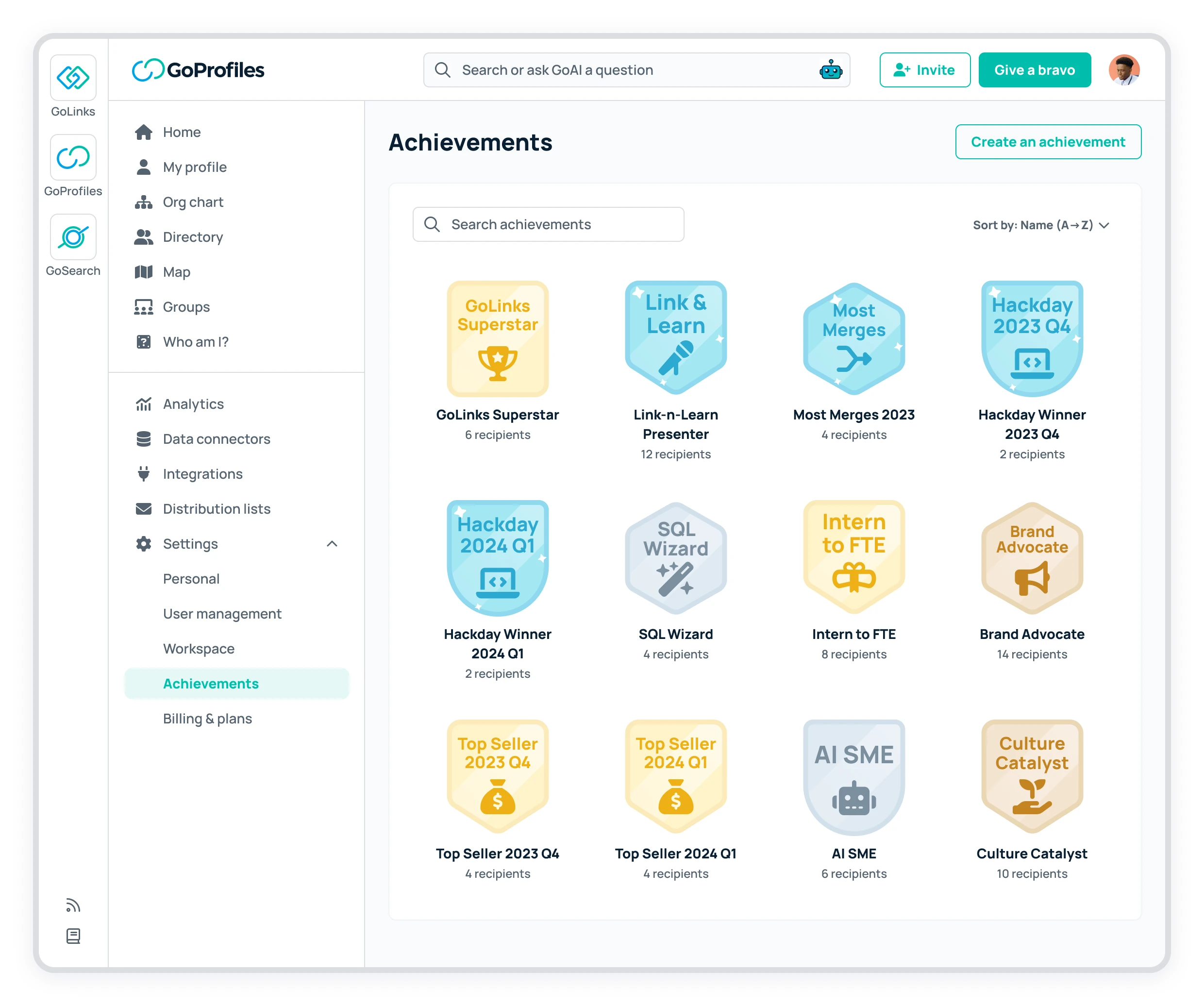
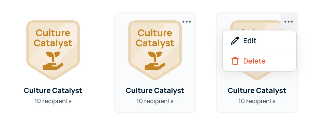
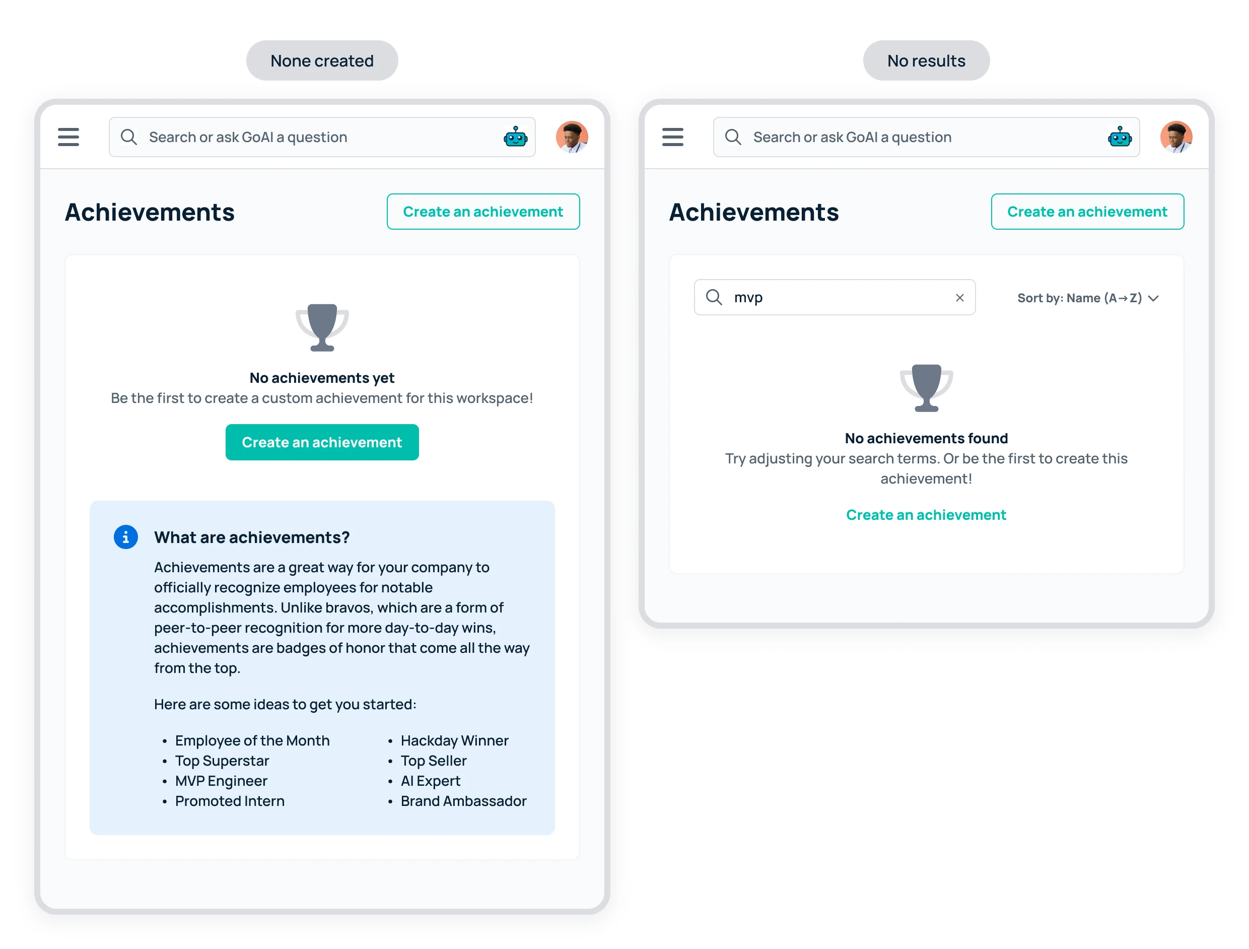
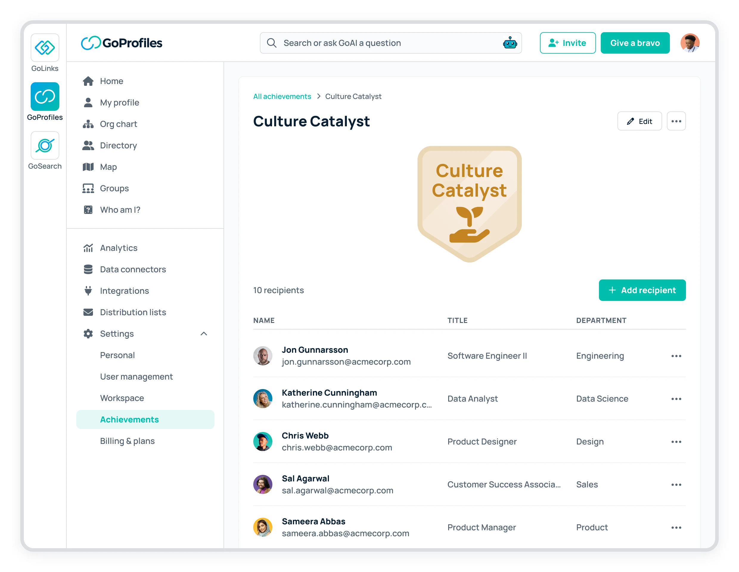
We needed a page in the platform where admins could view and manage all the custom achievements in their workspace. This would also serve as the entry point for the creation modal.
I put together a simple design that used some existing patterns and conventions that we had implemented in other parts of the platform.
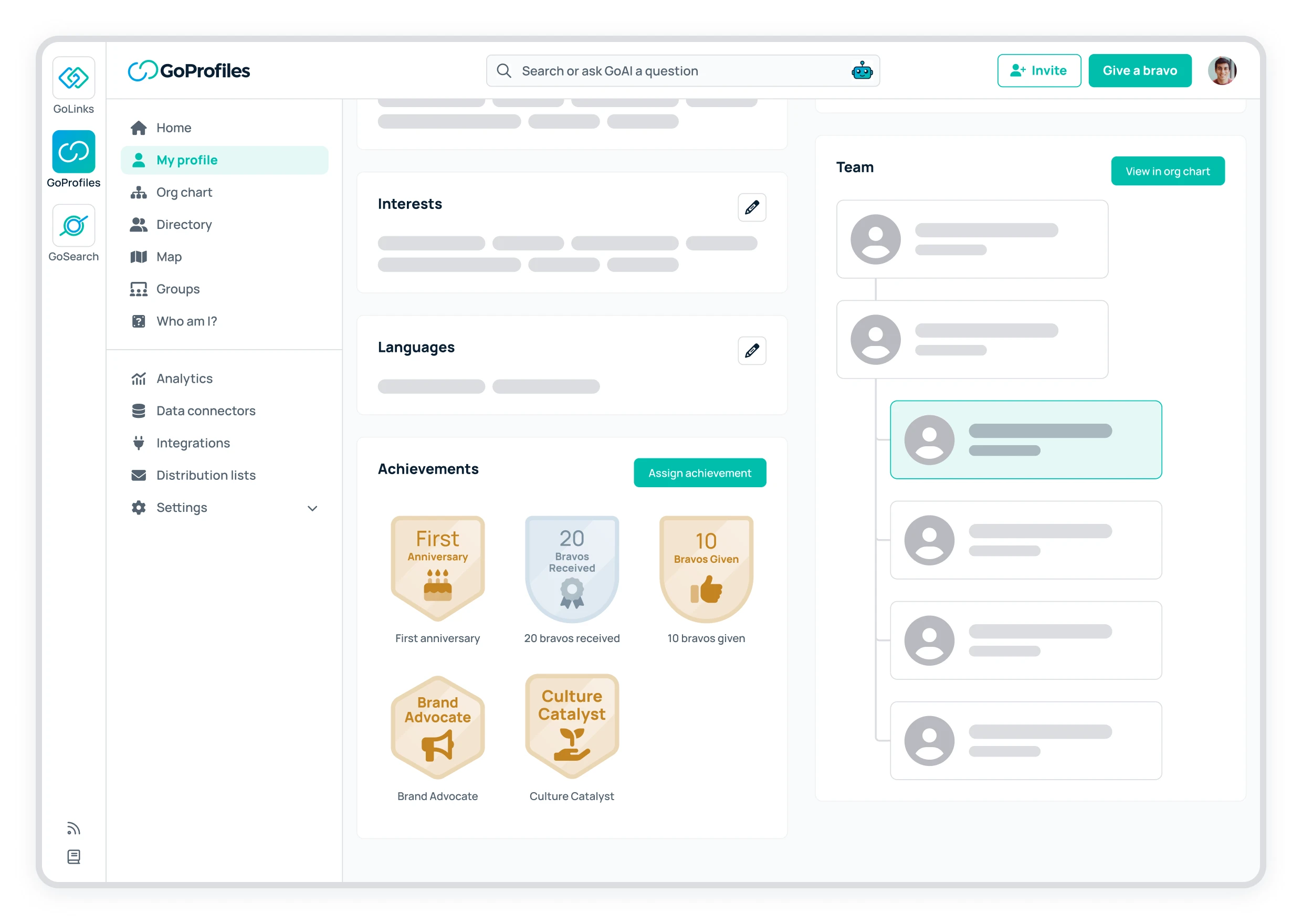
We already had a section on user profiles dedicated to displaying achievements since we had already implemented the default, automated achievements previously mentioned. I did not see a need to make any drastic changes to this section, as it was already pretty scalable. The only necessary change for this iteration was adding a way for admins to assign/award an achievement to the user whose profile is being viewed. We already had a pattern established in these profile cards for incorporating a CTA, so the solution was pretty straightforward.
Before releasing this new feature to our customers, we piloted it internally. This is a strategy we had used a number of times before when releasing larger features or updates. As daily users of our own product, we were able to collect more user feedback, analyze usage, and make sure everything was working smoothly.
As this was the first release of the custom achievements feature, there was a lot of room for further improvement and iteration. A couple takeaways:
When we launched this feature internally, we started off using it as intended: as a way for the company to acknowledge the larger, more meaningful accomplishments of individual employees. But soon after, people started using this feature to highlight other types of accomplishments as well. While not exactly our intent, this provided some useful insights.
Ideally, I did not want this feature to become a catch-all solution for highlighting anything and everything. I figured this would dilute the significance of receiving this kind of achievement. However, by witnessing this broader usage, we were able to see where some of the gaps were.
For example, it became common to use this feature to showcase courses and certifications that employees had recently completed or earned – courses such as those about generative AI, LLMs, and related topics; and certifications such as PMP, CompTIA Security+, and AWS Cloud Practitioner. We had not yet implemented a unique profile category for this type of data, but with the emerging excitement and curiosity around AI, and tech workers taking the time to learn more about these advancements, we figured we should probably bump up the priority of this new profile category.
As mentioned earlier, we wanted to add the ability for users to access the entire Font Awesome library when selecting badge icons. This would lower the bar for creating new achievements.
Depending on feature adoption, there could also be value in exploring additional image editing capabilities when the user opts to upload their own image. For example, allowing the user to convert their image into a monotone that better matches the badge color they selected. This could also help promote more visual harmony across the workspace with better-looking achievement badges.
Some achievements are confined to a specific period of time. For example, a company might want an "MVP of 2023," "MVP of 2024," etc. Or perhaps even more granular than that, such as by quarter. Over time, these recurring time-based achievements might clutter the experience and be difficult to manage. It would be worth exploring how to better support this. Should all the time-specific achievements roll up under a time-agnostic achievement? Is there a better way to visually represent the time component?
Default, automated achievements were initially omitted from the scope for simplicity, and because users were not yet able to modify them in the platform. However, it makes sense to represent them on the page.
These were some of the considerations and questions we wanted to continuing asking as more data rolled in.