Primary goals
- Increase employee awareness of projects and achievements across organization
- Increase transparency
- Applaud success and spotlight good work
A social app for employees to share work-related victories
As organizations grow, one of the hardest internal challenges often is keeping everyone up-to-date and informed on the projects and achievements within the organization. Teams and departments grow more siloed and start to lose a sense of the bigger picture.
We can combat these issues by increasing transparency and encouraging people across the organization to socialize their accomplishments. The solution is a platform that promotes this type of sharing and gives people the opportunity to applaud their peers. When paired with a nurturing and transparent leadership, this product can help create an environment where employees are more eager to achieve, feel part of the larger whole, and become bigger advocates for the brand.
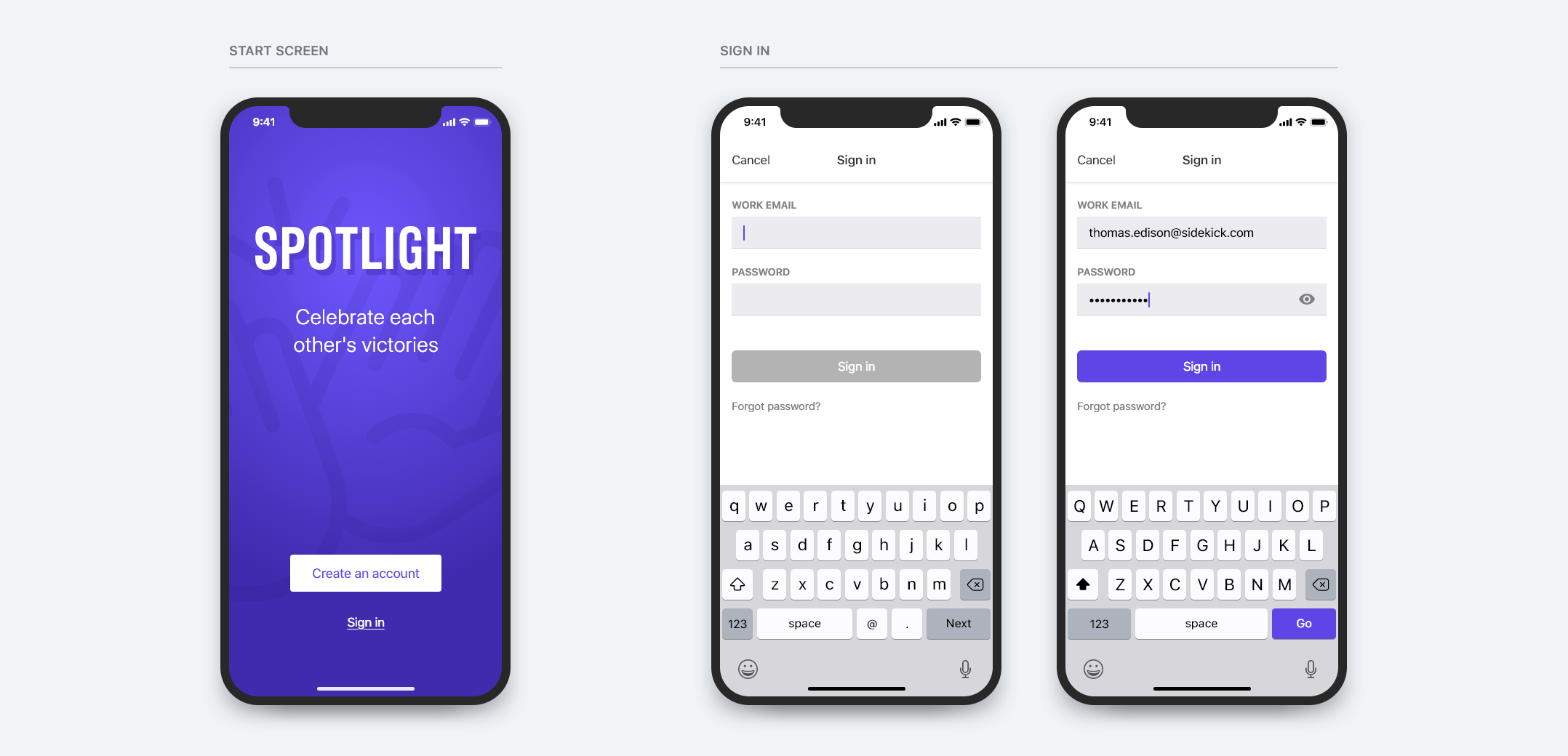
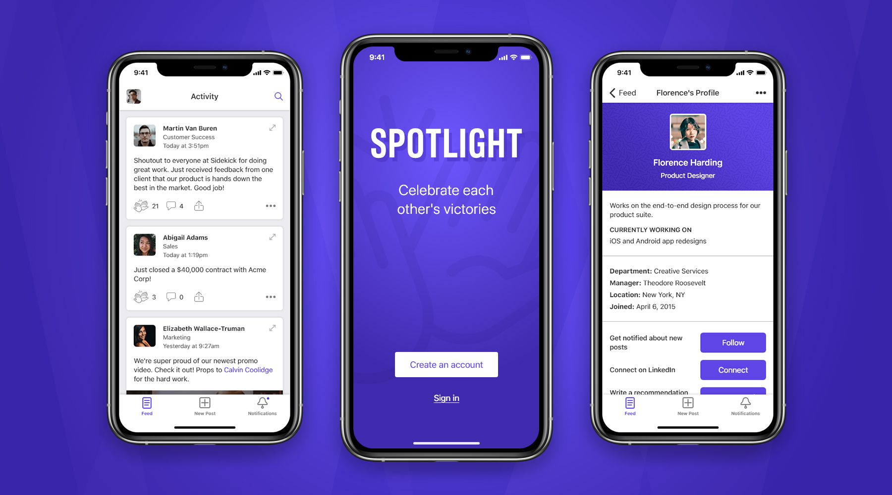
Spotlight is an enterprise social app that facilitates the sharing and applauding of accomplishments across an organization.
To be successful as an enterprise product, Spotlight would be cross-platform, available as a web application and on iOS and Android.
For the purpose of this exercise and proof of concept, I chose to design what would be the iOS app.
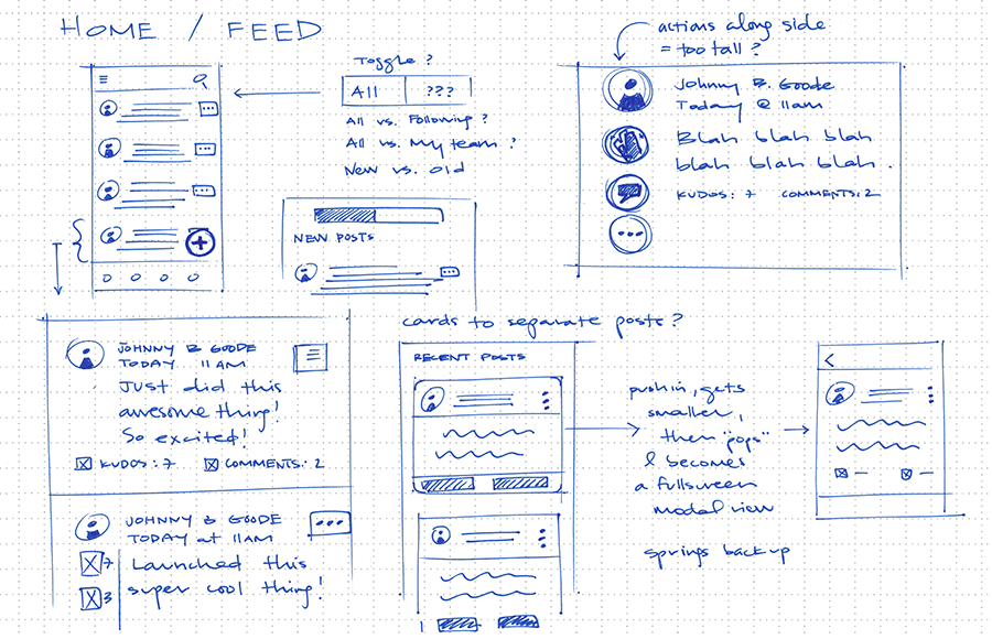
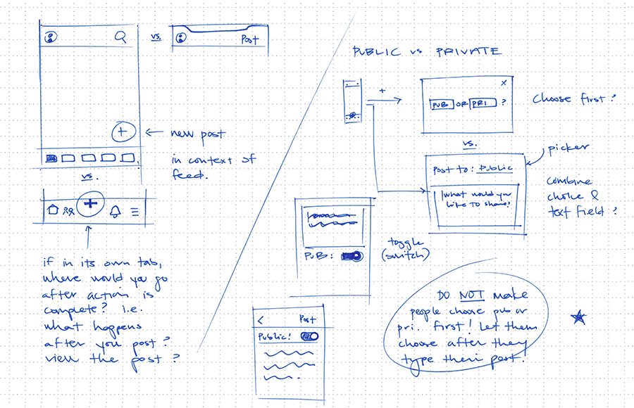
Some preliminary sketches and notes aimed at better understanding the problem, identifying obstacles, and working through possible solutions and opportunities.
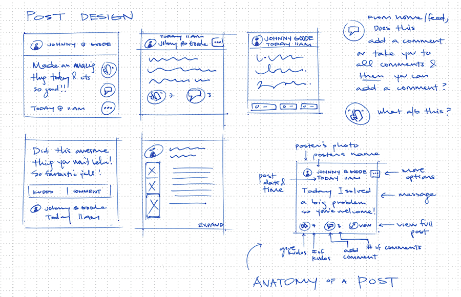
An important detail I wanted to ideate on early was the action users took to congratulate a coworker on their accomplishment.
I considered the obvious solutions already made popular by other apps in market, as well as a few others, such as:
But these didn't quite communicate what I thought would be best for Spotlight. The closest was "applause," but that was a little too formal.
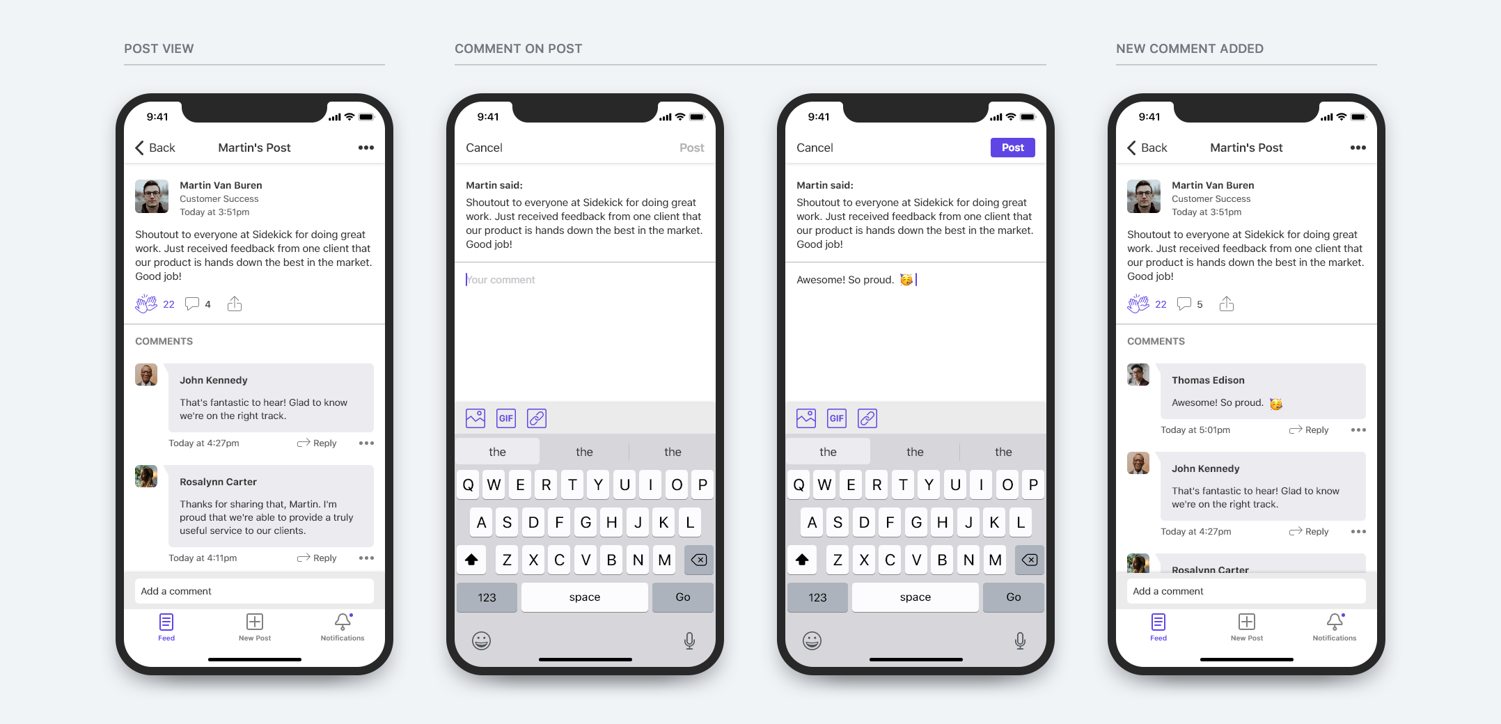
I decided a "high five" was exactly the right type of message. Informal, effective, energizing, and applicable to any and all types of accomplishments, regardless of size or impact.

I mapped the primary app screens and user actions. I also highlighted the red routes, which represent the most common use cases and journeys through the app.
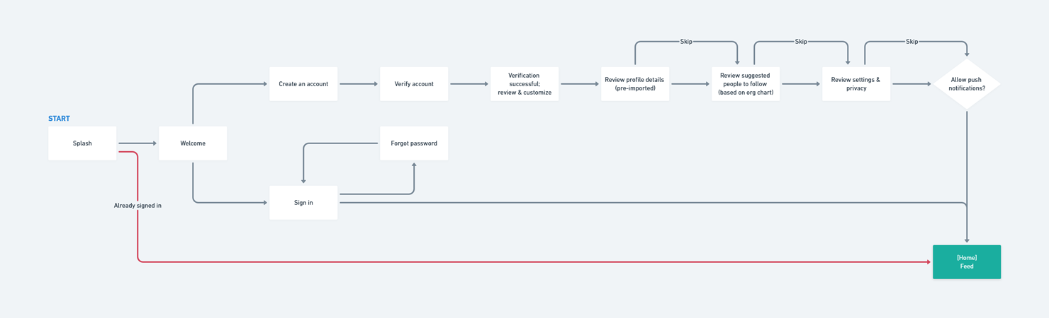
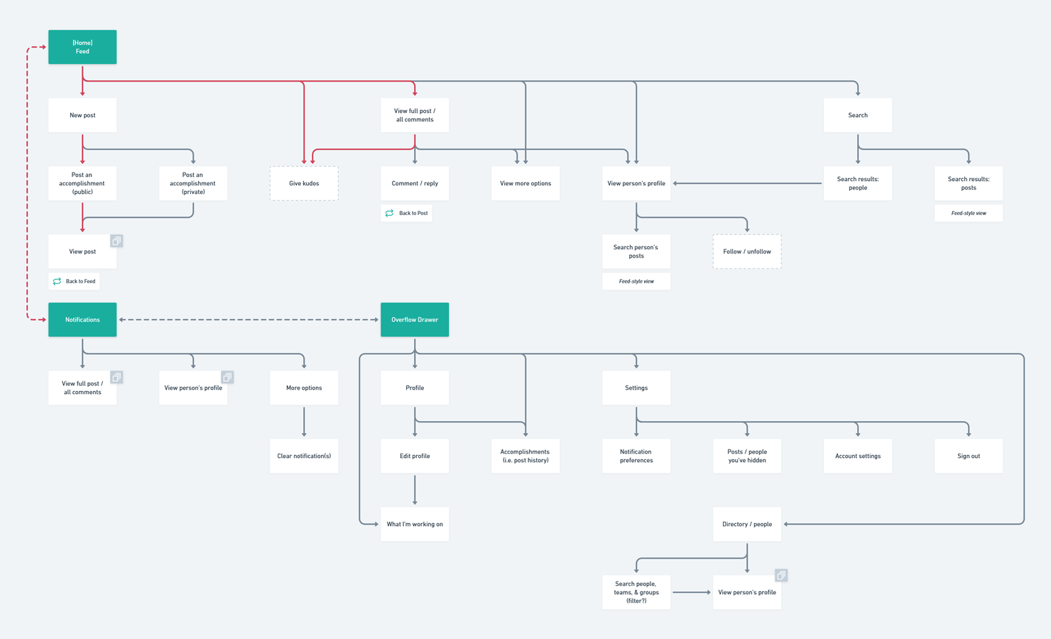
While mapping the user flow, I knew I would need to dedicate some time to refining the overall navigational structure of the app. In other words, what are the primary actions/views that need to be captured as tabs? And what other important actions should be captured as nav bar elements? Should they be local to a specific screen or global? I wanted to keep the navigation simple and focused, catering to the most common use cases, while still making the remaining actions accessible.
Most common screens users will need quick access to:
Feed — Notifications — New Post — Search — Profile
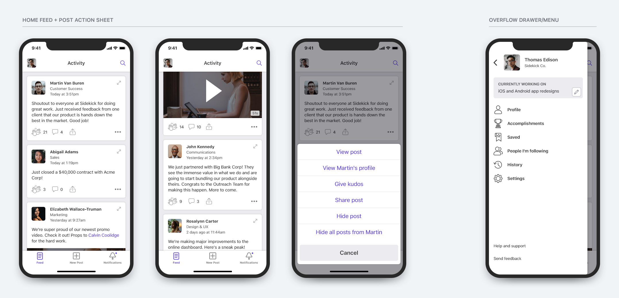
Feed
Feed is the home tab where people will spend most of their time. Naturally, this should be the far left tab.
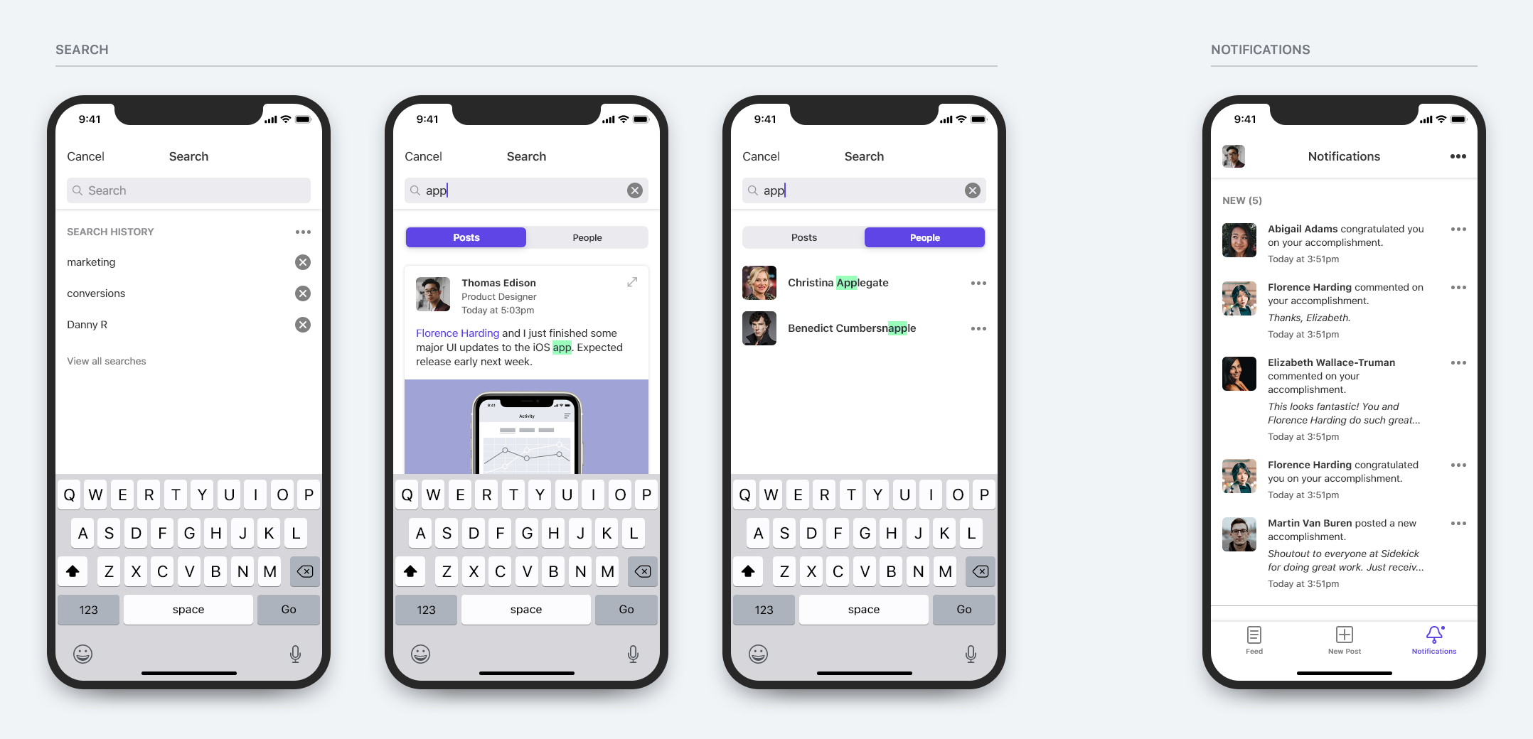
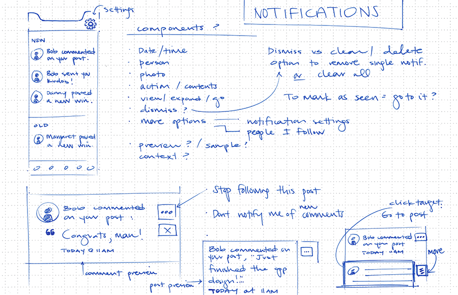
Notifications
Notifications will likely be the main driver of app usage in the first place. In other words, notifications of activity in the app will bring people back in. We also tend to have a desire to "complete" and "clear" notifications, so easy access in the tab bar seems logical.
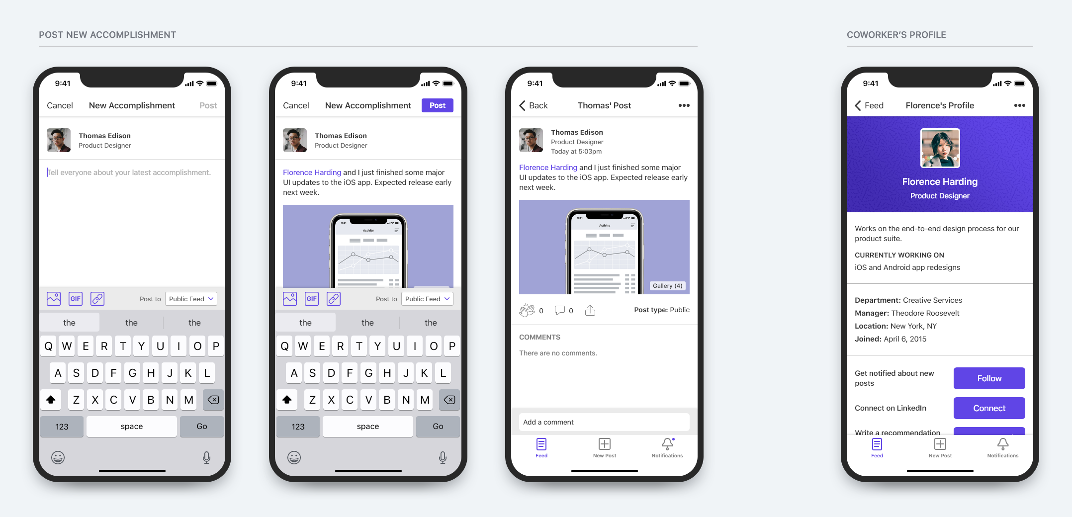
New Post
Although people won't be posting content as often as they're consuming it, it's important that creating a new post is as effortless as possible to encourage use. Without people posting their accomplishments, the product cannot succeed.
The scope of this action can be viewed one of two ways: (1) local to the feed, or (2) global. I believe that in the most technical sense, adding a new post is local to the feed. This means the action would be accessible only on the Feed screen. But considering its importance to the app overall, it may be better to include it in the global tab bar.
Based on existing paradigms, I considered the following options:
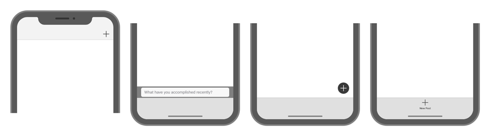
I decided that the New Post action is too foundational to the app to constrain to a single screen. So, I opted to move it into the tab bar, which is (or is perceived to be) the most global placement.
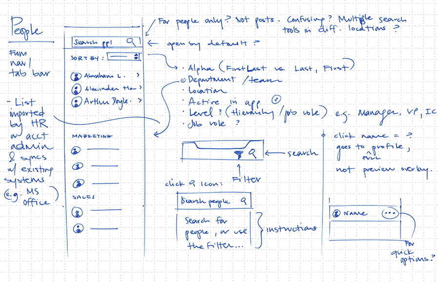
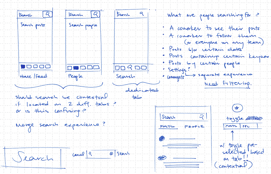
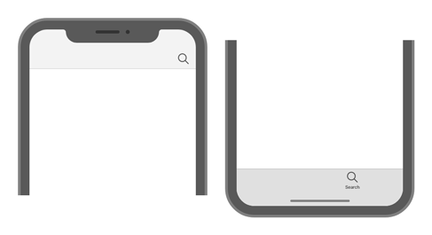
Search
Search shares a similar question of scope as New Post does. Frequency of use is also an important variable to consider. As a first implementation of this feature, users should be able to search (1) post content from the feed, and (2) people from the organization's directory. To keep it simple, I would implement one search feature with a segmented control to switch between the two. If I keep search local in scope to the Feed and Directory screens, depending on where you are at the time will dictate which segment is pre-selected. Alternatively, I could make search global and add it to the tab bar. This approach is optimal when search usage is high, but I expect minimal usage for this product. As such, I opted to keep search local and accessible via the navigation bar.
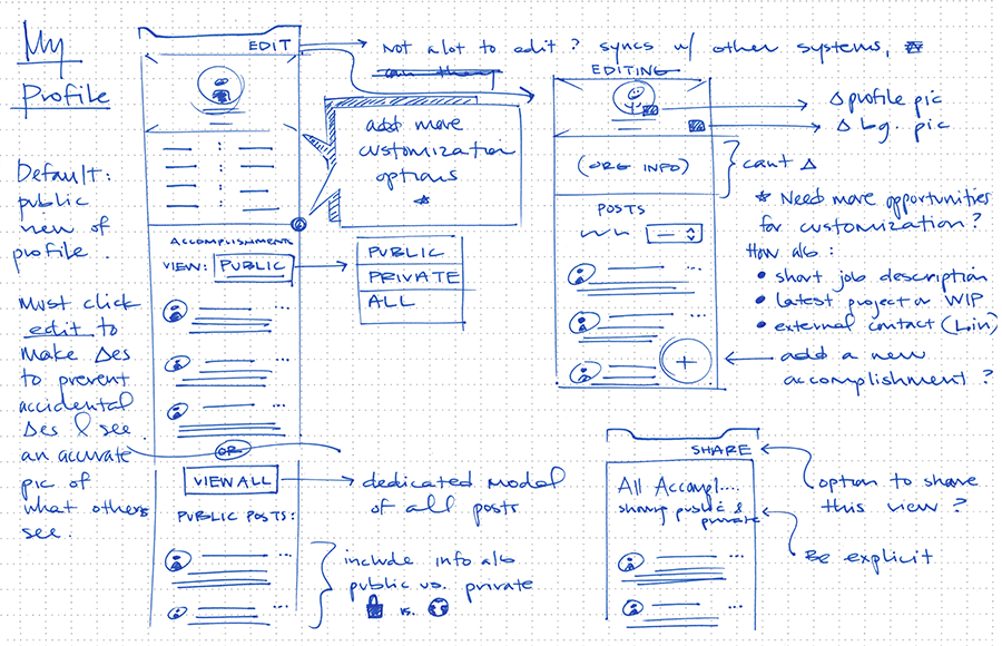
Profile
In the absence of app usage data, I had to determine if Profile should be accessible via the tab bar (frequent access) or hidden one level deeper (occasional access). I figured most people would not need immediate access to their profile on a regular basis, so I explored ways to de-prioritize it in the heirarchy. This likely meant placing it in an overflow menu.
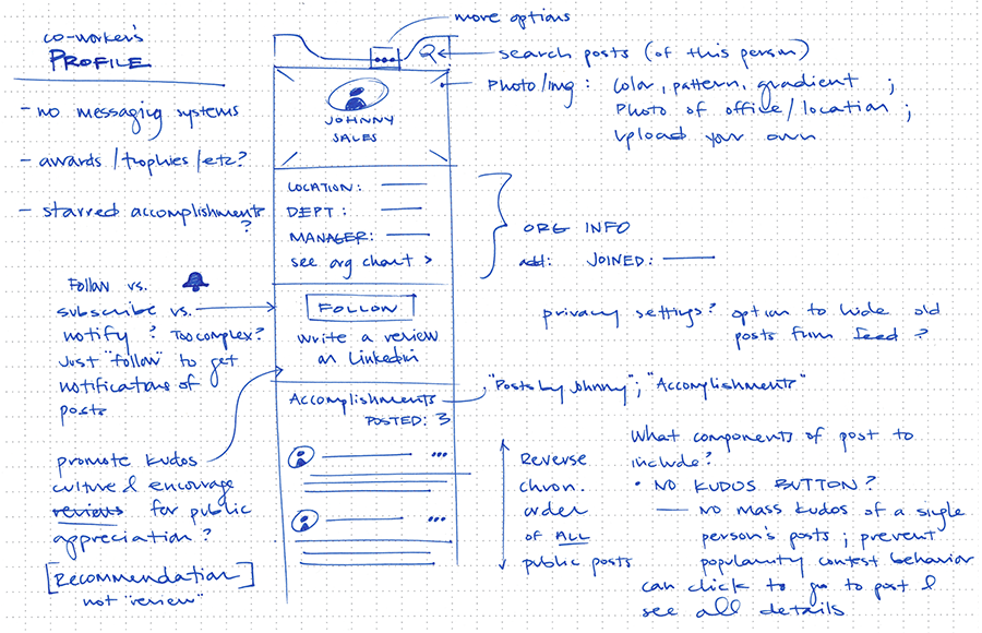
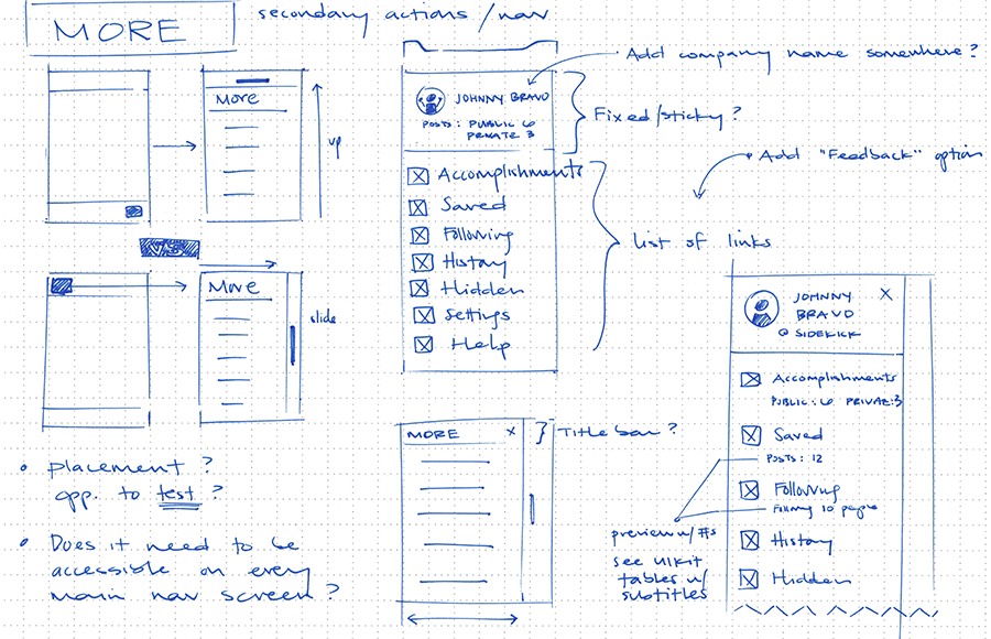
More (Overflow)
I already knew I'd need an overflow screen because there were other sections of the app not accessible via the tabs. Also, now that I had to figure out how to handle Profile, I thought it'd be best to think of these two sections simultaneously. There's a paradigm that's becoming increasingly more common where one's profile photo or icon is used in lieu of the More icon. I thought my app would be an appropriate candidate for that approach, so I began ideating.
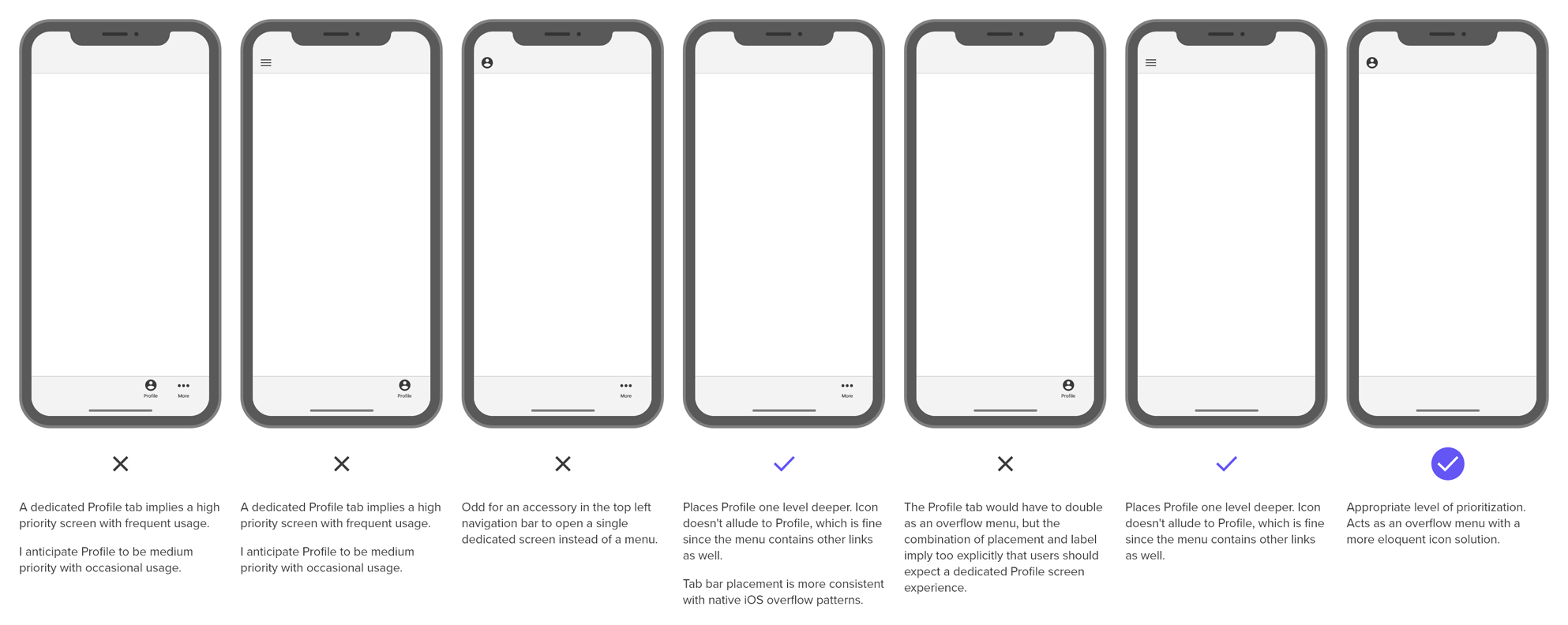
I found the best approach to be a profile icon in the navigation bar that acted as an overflow menu with quick access to the Profile section from there.
After mapping out how someone might navigate and use the app, I began wireframing individual screens and features. Not yet concerned about visual fidelity, I needed to investigate which elements and actions should be present on each screen in order for the user to accomplish each task and move through the app seamlessly.
A snapshot of wireframes and iterations exploring screen and feature architecture:
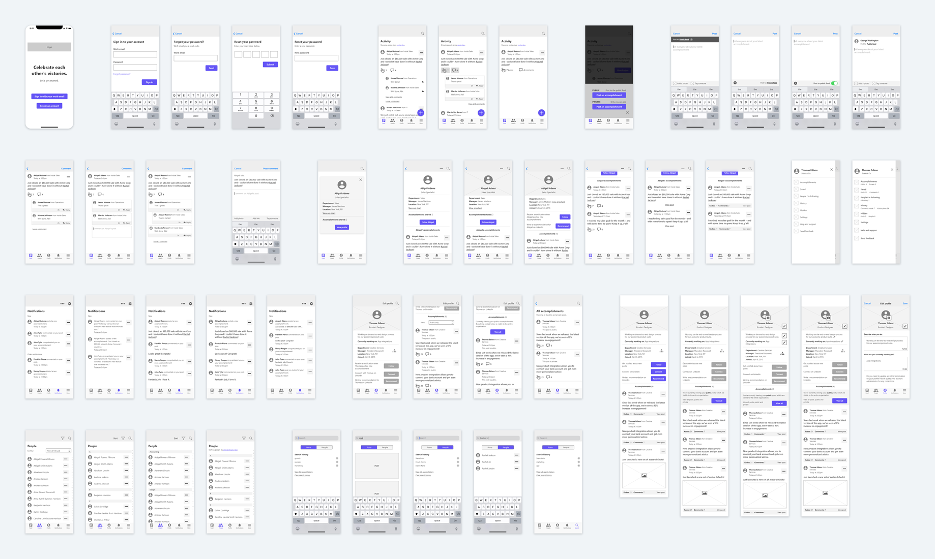
Moving next into visual design of the UI, I iterated through higher fidelity designs while maintaining a focus on the user experience and interaction implications.
Final mockups of the app's major screens: